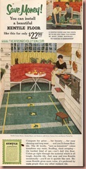
I just thought I would share this interesting ad for Kentile vinyl tiles.

I like that they exterior siding that looks like a cross between Cedar shake and clapboard is used here. It gives a very indoor/outdoor look. The open grill which mother is cooking on while daughter watches continues the Barbeque indoors.
That tufted orange breakfast nook looks very inviting. And look how the drawers are part of the exterior siding look, so when closed they appear as a continuous outside wall.
The use of copper in the hood and the pans brings the warm hues of the breakfast nook. The yellow cafe curtains tie in the use of yellow in the tiles.
Sadly many of these early vinyl tiles included asbestos. So, I am not sure that they are dangerous unless you were to break them open and breath them? I wonder if they would still be safe to use if you had these already. Though, I am certain the 1980’s saw most of these floors into the dumpster and landfills.
What do you think of this color scheme and layout? It seems the concept of design was very theatrical in the 1950’s probably heavily influenced by the larger than life Technicolor sets in Hollywood films.


I never appreciated those movies growing up-now I look at the interiors and think WOW!
ReplyDeleteMy parents have this cool tile in their basement, their home was built around 1956, ranch style, and it was put in the recreation room and main room downstairs (used to be the guy`s study), it`s still there too under the carpet that now stands.
ReplyDeleteIf I moved into the house and it had such tile I wouldn`t worry too much about the abestos, heck in most cities air quality is so awful that cancer is on the rise.
Mom in Canada
Zoot-Aren't they amazing? It is rather a concievable design scheme when you really think about it. As they were always awash with a specific color scheme: Pink, Yellow etc and then with two contrasting or complementary colors, they went with it. Painting all surfaces in one shade, accessories similar shade and so on. It is a very modern way to view design. Really Art Deco started this with their stark black and white unified London and New York apartments and Ocean Liners of the 20s/30s. I love Design history. Heck, I love fashion history, every history!
ReplyDeletemom in Canada-Very true. In fact I can't imagine they would be harmful Except once they were picked up and removed. A friend told me that now in California the air quality is horrible again with the smog. During the 70's and into the early 80's they had finally begun to get a handle on the air quality but after the advent of the big SUV and yearly increase in population and amount of cars per family, they have worse air than before! Scary, isn't it. Its an odd thing. We often get up in arms about cigarette smoke and how bad it is despite it being advertised as fine, yet the very cars we drive and continually up size and increase per family is actually also creating toxic air. Oh, well. I think we, as people, tend to go for the three monkey aspect of living See, Hear, Speak no evil and then it isn't there, right?
You know it's a style thing (just blogged about this regarding shoes :)) These kitchens have such style. SO much more interesting than 'let's all have hardwood floors, neutral walls and granite counter tops' recommended on too many home improvement shows.
ReplyDelete