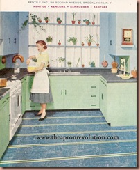
 We talked recently about the fun color combination of Pink and Green. Today I thought I would show you the lovely pairing of Blue and Green. This is particularly effective in any style but especially in a Vintage room. When one uses Robin’s egg blue and a pistachio Green as we see the great result as evidenced in this very modern kitchen.
Using two colors in a room can be even easier than one. It allows you to set the stage for your decorating and then you can keep your eye on that dual color range when buying furniture, accessories, what have you.
 Now, Dark green, almost a Fern Green was also popular in the 1950’s and we often see that paired with pale blues as well as in this bathroom makeover.
 I have to say I almost prefer the before picture (there in the bottom left) but if you are going to do a Vintage look, go Bold! Make sure you are committed and go the whole nine yards. The detail in the linoleum on this floor is a masterpiece and the ceiling was included. I think if you wanted a vintage bathroom, mixing bits of soon to be dated modern 21st century pieces with the old to try and from some ‘balance’ might make the room feel disjointed or confused. Go for it, because the 1950’s style was very Bold and doesn’t do well when watered down, I think.
Also a simple room with say pink and black with tiled half walls, floors of white and black hex, vintage plastic shower curtain and vintage wire shelves and decoration (such as metal fish for the wall and a lady head on the lav tank) and a few colored towels in pink and white would still be bold and not as involved as our sample picture here. But, isn’t it fun to see the outlandish examples in the magazines of the time?
 I think the use of Blue and Green in this kitchen is adorable. It also goes to show you, why have your top and bottom cabinets match? Their colors meet half way in the floor of blue and green. It also seems to make the room feel more alive than just one solid wash of color. And look how lovely the copper molds and pans and terra cotta pots add warmth to the cool colors of the room. And what a fun fix for a kitchen that is stuck with a plain white range.
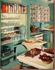
 I have shown this picture before, I think, and you can definitely see the color is strong here. It is almost a blue-green shade combined.
Any way you slice it, blue and green look good together. If you don’t want to try it in a room, it looks fresh and lovely in Spring and Summer on your dresses and clothes.
Enjoy this Bell Telephone short which shows some fun color combinations to decorate your home (of course they coordinate with the new Bell Telephones in color)
Enjoy your day and Happy Homemaking. Maybe put some blue and green items together today and see how you feel about their pairing.


The blue and green colors look so soothing together - makes me want to freshen up something with a touch of "Robin's Egg Blue". Maybe I'll retrim one of my hats in those colors :)
ReplyDeleteAs I was out today (and going back for me) in our barn outbuilding organizing and clenaing, I found some fabric I had in storage. The colors? You guessed it, Blue and Green! They are actually jersey knit and I think I might make myself a lovely sleeper set of nightgowns (one green with blue the other blue with green). And though they are jersey, they will still look lovely with my robin's egg blue 50's nylon tricot dressing gown in all its flowly laced loveliness.
ReplyDeleteI love how bold and fanciful the color schemes were at that time. My grandmother's house was heavy on the fern green with copper molds hanging on the walls of the kitchen. I think her phone was green too.
ReplyDeleteI've always loved blue and green. The 50's version is so soothing versus the late 70's navy and hunter, although I like that too. My mother had the 70's blue and green combo in our kitchen. It looked great with our harvest gold fridge!
ReplyDeleteSarah
I love your colour scheme articles. I would never have thought that fern green and pale blue would work, but it looks SO lovely. :)
ReplyDeleteLoved these shorts! The idea of a cordless mobile phone. . .funny :) Everything comes back around, eh? The color schemes could be in today's catalogs. . .just better photography/lighting today.
ReplyDeleteWe have those exact chairs from the Daystrom magazine! They were my great-gandfather's and we were lucky enough to inherit them.
ReplyDelete