I found a wonderful folder full of images from the Kirsch Company in a box of family items. I believe it was my hubby’s Maternal Grandmother’s, as she went to College for Interior Design in the 1930’s. I believe, however, that these seem to be from the 1940s. I am guessing they are post war 1940’s by their design, but there is no date on the folder.
There are quite a few separate sheets, each containing two drawings with descriptions. You can imagine they are mostly focused on the drapery, as this is advertising material from the company, but the interiors are so lovely I just wanted to share some of them.


 I think this feminine room is quite lovely and they are making use of Pink and Green. I like that the lightness of the pink floats on the ceiling, the soft green paper envelopes the room and a deep burgundy (a deep Pink really) grounds the space. I know a gal could feel pretty and lovely in a space like this at that vanity each day, don’t you think?
 This clean and modern kitchen shows that red and green (Complimentary colors on the color wheel) are not meant to be relegated only to the Christmas Season. As an aside, when they speak of ‘glass’ curtains they are referring to fiberglass. This material was the rage and the sheer ruffled curtains often seen in movies and interiors of the time where indeed this new material, needing no iron and lasting forever.
  The cheery cherry red on these counter tops are highlighted in the curtains and the wonderful geraniums on the window’s ledge.
 I think this kitchen has such an interesting feature. Look under the sink ( a space which can become cluttered or poorly used) and see how airy it is. They have installed glass block to allow light through. That is what makes me think these images could actually be from the late 30’s as well as into the 1940’s. Particularly this last one has the look of a kitchen one might see in a Shirley Temple movie.
  I love a crisp white and a deep navy. It always looks as sharp and fresh as a summer’s day, evoking sailing and sharp beach umbrellas. I love the built in next to the sink, as well. I am always a sucker for a good shelf for display in the kitchen.
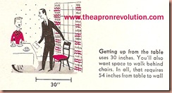
I thought I would close with these good tips on spaces in placing interiors. They are always good to keep in mind in your home, I think.


 I hope these little tips help. I sometimes to refer to them when I rearrange things in the house.
There is a new Vintage Daily News today (simply click image to the right). Happy Homemaking.


Oh my, how I love those images - the banquettes and booths are my favorites, the colors look as fresh and interesting as they did then. Am so sick of neutral design. And the tips are handy as we are trying to arrange our home after putting in new floors, thanks!
ReplyDeleteOur house was built in 1920 with additions on either side that were added in '59. Both bathrooms are 50s bathrooms. My son's bathroom just needs to have the '80s carpet removed and replaced with 4 inch white tile.
ReplyDeleteOur bathroom has water damage on the floor and the blue tiles in the shower have some damage on the bottom.
We will redo the shower bottom and floor with 4 inch white tile as well.
The vanity is very 50s and I can tell it was pink at one time!
I have been on-line checking out the 50s bathrooms so we can keep them in that era.
What a fun post today.............Denise
I love the colors in these old interior decoration guides. And how cute are the "Goofus and Gallant" couple at the bottom. I'll learn from their mistakes! :) Thanks for posting.
ReplyDeleteLisa-I know, aren't they (the characters) funny. I think they are good measurments to keep in mind when arranging the home though, don't you?
ReplyDeleteDJJ-I agree with grey/beige and granite.
RMH-That's great that you are going to keep them in their era.