 When bathrooms began to become the norm for the middle class most fixtures were available only in white. There are some lovely examples of hand-painted china type but would have most likely been in a more well to do home.
 These lovely delicate blue and white pieces would have most likely adorned new bathrooms in an English Country house of the upper classes or the more well to do suburbs of the upper middle class.
 For the most part an early bathroom would have had only white porcelain options.
Today, the return to mainly white fixtures is largely due to the real estate boom, or rather the bubble. As we began to see our homes as an earning position rather than where we live, we needed to see the place as a general blank canvas for others to view and envision their own dreams. That means white walls, beige carpet and white fixtures in bath and kitchen. Now, there is nothing wrong with white fixtures and I actually rather like the older fixtures from the last centuries turn with tall wooden water boxes exposed nickel plumbing and gleaming white porcelain.
 Though these are usual in an interesting shape or style and with details such as marble topped sinks or pretty flushing handles on the lav. Today’s version are the plain white “Builder’s Choice” with no flair or individuality.
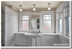
 And today, when we do express some of the current style, it actually has a very early 1900’s look as does this bath with its white subway tiles, white squared pedestal sink, and light fixtures and windows that would look right in a 1912 Arts & Craft home.
  And though some metal versions were becoming available with more flourished design, the colors of the mid-century American bathroom were for the most part unknown.
But, by the 1950’s color was everywhere. Coming out of the war years it was a breath of fresh air. Though we must also realize that while it had its brilliance of decorating styles it was also meant to make current homeowners unhappy with their pre war baths and long to change it out. Money was becoming available in the US post war and industry was building so there needed to be an increase in want over need. The idea of the new luxe bath redo in bright colors fit the bill. Any one wanting to shake off the old pre war gloom could buy, on credit, a new improved bathroom in bright colors and bold design.
In all the new construction, however, a new homeowner could face their one bathroom with a decorator’s delight. And there was no right or wrong about color combinations as we can see in some of the outlandish color mixing of the mid century American bathroom.
 Tangerine bold with apricot walls and deep sea blue green floors and walls. A new take on nautical that makes navy, white, and crisp red look like Nautical’s shy cousin.
 Even dark colored hues were available as this American Standard green color called Tourmaline.
 And this manly dark maroon set.
 And when white was used there was still boldness in tile colors and accessories. Like this 1950’s Kohler ad showing white but with daring teal walls and orange and pink accessories all floating on a deep black floor. There is nothing wishy washy about these styles.
I found these wonderful examples of bathroom colors and styles and coordinating ‘go-along’ colors that I thought would be great to view for fun and also for anyone attempting an accurate re-creation of a mid century bath.
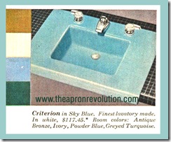
 Sky blue is one of my personal favorites. And here we see examples of coordinates. They are Antique Bronze, Ivory, Powder Blue, and Greyed Turquoise. Though the faded old magazine makes it appear more dark green we can see that a grayed turquoise would be lovely on the walls and I even think the green, which it appears now, would also be a wonderful companion. And the antique bronze could be added with some wonderful plush harvest gold towels and rug.
 Here we see sky blue again and in one of my favorite combos: Robins Egg blue and Sky blue with crisp white and accents of red. Very 50’s and also fresh even today.
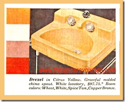
 Citrus yellow is so crisp and cheery. I like this color combination and actually this is similar to the colors of my little kitchen which allows the robin’s egg blue of my temporama vintage 1950’s everyday dishes really to be showcased. So that is another pairing that would work with yellow fixtures.
 Peachy tones with earthy browns would help to enliven those who are stuck with the 1980’s version of these tan fixtures often seen in builders homes of the day.
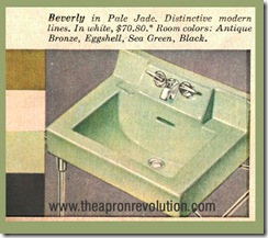
 This lovely light jade would also be wonderful in a bath with pink, as pink and green is not only one of my own favorite color combinations but was rather popular in the 1950’s as seen here.
 and of course the reverse was also popular.
 The room colors included in the guide for the Persian red are So 1950s: Black Pink, and Grey. This color should not be confused with the deeper burgandy, as seen in the photo above, as this was a more cherry almost kitchen red. One could take this color combo in a current bath with white fixtures and then use the black pink grey and red as color, floor, wall, and accessories. A modern white bath could go with a black vinyl floor with the grey and pink fleck (the industrial tiles available at most big box stores) and paint the bottom half of the wall pink and the top half (mimicking the affect of tile) grey and grey onto the ceiling. Then Red towels red rug and shower curtain. That would be a powerful mid century look with little work. Or even paint an old vinyl tile floor deep black and give it 4-5 coats of poly for a new old look.
 The bold colors recommended to go with the white fixtures show the bold attempts at color combinations. These colors would be great in a modern or mid-century house.
 I think with today’s new love affair with grey this lovely French grey would be so pretty especially in a pink or yellow room. I love grey and yellow together and with crisp black and dashes of lemon yellow, as here suggested, would be a good guide for many rooms from bedroom to even kitchen.
 And last but not least, pink. The color of the 1950’s. Here, again, we see a very 50’s color palette of Black, red, grey, white, and pink. These are also very fresh colors for today. And sometimes this was the most bold mainly monochromatic as we see here, with touches of red, but really just darker pink.
Now that we are beginning to see our homes as a place to live and in some instances gather various family together who are having hard times, if we will approach our decorating in more bold ways. As we continue to think of home as a refuge from the harsh world of war, failing banks, increasing unemployment and lower wages we may begin to nest more. And that safe haven may want to be enlivened with color. The beige and grey and white of the house flipping hey day of the early 21st century may give way to the homey, slightly kitsch, grandmotherly love of color and comfort. The little joys in a lovely little bath with some rose scented soaps in the shapes of sea shells. The smile we get when we see the cut out black and pink angel fish decals that we cut out with aunt sally who moved back in. Or uncle John, who lost his home, may be happy to use his handy skills to build you a built in the bath and paint it green and pink with seashell decals gleaned from the low cost entertainment of yard sale shopping. And when we look to redo a bath or even add one for our growing family of relatives having to return to your nest, maybe using these lovely old 1950’s fixtures will be more popular. If they have lasted this long they are well worth installing in a new or bath reno.
And in bringing in their old reliable porcelain in colors of the rainbow, maybe we will be acknowledging the value of the past and the simple way to entertain ourselves with a smile and a laugh at the pink poodle sitting on the back of the toilet. The changing times need the past now more than ever.
Happy Homemaking and Happy Bathroom Dreaming!

I love the maroon and persian red. It is nice to see all the interesting colors.
ReplyDeleteWhile white kitchens and baths look lovely in photographs, I freely admit I would not want to spend the time to keep it so sparkling and looking as if it was in a photo shoot at all times.
Wonderful inspiration! I am currently int he building stages of adding a bathroom to a 1943 house that NEVER had an indoor toilet, and I want very much to mkae it look as if the bath had been there all along. So many great ideas! I think I might leave the pipes ont he outside of the walls. and while I have aquired a white enamel pedestal sink, and a 1940's white toilet I am planning to paint the cast iorn claw tub either a grass green, on noe maybe "manly maroon" So manyw ondeful color choices. Your homeis an investment, but home is always where the heart is! Make your heart happy!
ReplyDeleteGrowing up our upstairs bathroom for the girls was lavender tub, sinks, and toilet. The boys room was a teal blue of sorts. I never really thought about it, until you shared this post. Excellent ideas on being bold in our choices and leaving plain on the wayside.
ReplyDeleteJennifer
My grandparents built their home around 1957 (it has since been sold since their passing about 4 years ago), and my grandmother had a pink bathroom - pink floor tiles, pink tiles on the walls, pink walls, pink was everywhere! My grandfather's bathroom, which I believe was a later addition, had blue everywhere. Growing up I always thought it was strange and preferred my parents' modern baths, but now would give anything to have my grandmother's pink bath!
ReplyDeleteI've got that green sink in my bathroom right now. In our other house we had the pink tub and toilet. If it ain't broke, don't fix it I guess.
ReplyDelete