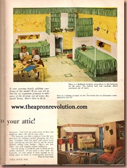
So, to keep it short and sweet, I thought I would scan and share these two images from a Home improvement magazine from 1954. The article (if you click on them you can read them) is about expanding into the attic. What I find so interesting is the bravery and single minded focus of such interior design. There is no wishy washy attitude here. There is a theme, a color palette and they go all out.


As I have mentioned before, the more I am exposed to vintage images and magazines, the more my own esthetic has changed. I know view these vinyl or linoleum floors in a new light. They allow endless design possibilities and must be a treat to vacuum and mop.
I might actually steal the idea from the little boys room for the aquarium build in. I love vintage aquariums (though they are hard to come by and are quite expensive) and look how clever this one is built in. Especially for goldfish, as you can enjoy them head on in a traditional aquarium manner, or from the top, such as you would a koi pond. Though, such a setup would not be good if you have cats.
I hope this little article provides a fun diversion for a small and late post today. Happy Homemaking to all.

