I recently did a few images for an art customer playing on such terms as Lobster Pot and Crab Cake” So, I thought I’d share the Crab Cake version. It was made for a greeting/event card and subsequently will be a shirt and bag. The inspiration, per my yearly project, was the past, 1950’s of course.
But first, as we are talking “Cake”, well sort of, I thought I’d share this video from 1945. It was put out by Betty Crocker and was to espouse their new one bowl easier method to cake baking. I have to admit that I was spurred onto simply making one of my favorite cake recipes in one bowl and found the result just as nice. And certainly the clean up was far easier. The film is entitled, “How to Bake a Cake:400 years in 4 minutes”. Their idealized version of the Past’s Cake baking is cute and very early Post War Quaint, I would call it. Though the modern version of the cake making is quite good and helpful.
Now, I won’t bother going into any sort of silly long apologies or excuses for my absence again. It is simply that with the added responsibility of my new Art plan for the coming year, I must find better ways to divide my time. When I was a full time homemaker, I had to learn to break up all the hats one must wear in that position and I believe I did it. Though it did take me some time and effort, but the result will always be dependent upon the hard work and diligence put into it. Just as I had to learn how to work Laundry and Marketing and Cleaning and Cooking/Baking and the list goes on, into a 7 day week while still having time for tea and magazines in the afternoon and sherry with the hubby after dinner for a wind down of my day, I too must now get a grip, as it were, on the wheel of this new vehicle I am trying to drive: Artist and Homemaker.
I am finding my training in scheduling and list making a great boon into reaching my art goals. To want to do something or to hope to create is only a small portion of the thing. The actual act of creation takes planning, organization and of course Doing. I am finding that many ‘creative’ types often feel that disarray and disorganization is meant to be part of the process. I, however, am finding that it is better to be a Homemaker in the Studio as well as in the house. There is no room for slovenly or lazy ways in either place. Now, that not is to say I don’t make a mess in the studio when I am in the actual ACT of creating, but it does mean that I have to write down and organize my thoughts and plans for the day. When I have an assignment rather for a customer or for myself (for hopefully future customers) I need to clearly put down the final goal and then flush out the steps I need to get there. And then I break that down into the days needed and here is the trick, ADD A DAY. That extra, its going to be done but this day is a ‘play day’ to make any changes or to improve on it. Then if you have it done before that day u can improve upon it. Or if you need, as I do and I think we all do sometimes, a moment of lazy or contemplative procrastination, better to do it then because at the end of the day you will know that you still have at least done the thing.
Today’s lil art project was for a customer who wanted me to make a vintage inspired image for a card bag and possibly shirt. I had done some other tongue in cheek images of things such as a Lobster Pot which was a lobster at a tea party holding a teapot…get it? Yes, obvious I know but people seemed to like it.
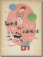
This image was to be Crab Cakes. I was inspired by the illustrations of a wonderful Dutch illustrator Eddy Dukkas. It is almost impossible to find any translated works that he has illustrated, but for my crab cakes I used a literal impression of this work of his here:


And I love the color palette, which is as much dictated by the limited ability of printing at the time. It is similar to the early 40’s cartoons I grew up with such as old Tom and Jerry and Little Audrey. In fact I used to walk about and sing the little Audrey song to myself all the time!
Even as I child I always loved the colors in those more than the modern cartoons of my day like Speed Racer etc. The colors always seemed so garish and loud. The muted almost brown color palettes of those early cartoons was simply due to what could be possible in the technology they had, but to me I much prefer those hues.
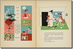
Here is a wonderful look at more of Dukkers work. Here are some pages of a book Karel and Mienet. A story of a boy and his cat and the adventures they have. I don’t speak Dutch but I do love the illustrations. These are from the early 1950’s.
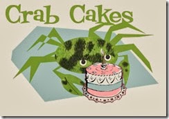
So my version is this:
I took liberties and used the color palette. I wanted that sharp almost tribal flatness mixed with a cookbook illustration of a cake. This is the preliminary work. It will get separated and turned into screens to print onto paper and fabric. I think it will made an adorable card and will look really spiffing on a bag.
I hope all are having a lovely day and Happy Homemaking and Happy Arting.


Love your illustration! Fabulous colors, so familiar, fun and comfortable!
ReplyDeleteI am really glad to find new posts since I was here last! Love the artwork. -Robyn V.
ReplyDeleteHi, 50sgal. I miss seeing your posts. Is everything okay?
ReplyDeleteIs this blog abandoned now? It was so muc better when you were doing 1950s. I miss it a lot!
ReplyDelete