This bedroom has no apologies. And the color combination is like a jewel box with Deep purple and coral pink and touches of teal blue. It makes me think of the colors of a coral reef.

 In fact, when you see this color in the context of nature, you can really see its beauty. And you could even add some orange to this bedroom with pillows and it would work as it does in nature. And you can see the boldness of this color scheme in a bath.
 Here the Golds and Browns remind me of this moth.
 And this same color scheme, with the green of the leaf, works in this dining room of Heywood-Wakefield Furnishing.
Even the Early American and Colonial mid century home boldness is the key.
 The contrast of the rough pine open shelves with the bright modern vinyl floor works because of the deliberateness of the room. The chosen items displayed in the window and on the shelves.
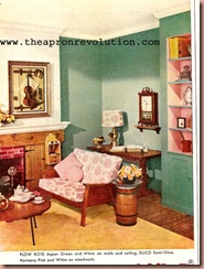
This living room gives me inspiration for my own actual 1700’s house using the bold strokes and colors of mid-century. The clean starkness of a Colonial home is enlivened with a daring pallette of pinks and greens. The inside of the shelves pick up the colors of the sofa fabric and even the pink tones in the brick.
 The mid-century decorator had an almost Victorian approach to color. Though they were much more selective with objects than their Victorian ancestors, the colors remind me of the unhindered use of color.
 There seems to be a deliberateness and confident action in ‘what is right and what should be done’ in many things done in the 1950s. And though there were things we are glad to have moved away from, the feeling of rightness of place and mature decision seems to permeate the decade as a whole. That is something I have truly come to love about my project and the decade.
Now, onto sewing.
 That same boldness of color and decision surely hit me in the making of my latest dress. Though it is not yet done, I wanted to share with you my latest attempt.
 I found this lovely navy fabric with the dots of red white and a lighter blue. It just screamed vintage, though there was not enough to make an entire dress. So, I chose to match the lighter blue dot and used a solid cotton. The skirt will be the solid blue and trimmed in the patterned fabric. I had wanted to make a peter pan collar, but it did not work out as I had planned. So I am taking the large scale ric rac you see and pinning it and placing it where I would like to cut the new neckline. It will dip in the back like this.
 Now you can still see the fabric above the ric rac, but I will pin the ric rac down and then cut the new neckline, hem it and attach the rick rack to the neckline. I adore the look and to me it was a natural conclusion. It has a determined action of color and boldness the old me may not have taken, but now, 1956 style, it seems, well, natural. I will share the dress when it is done with how I trimmed the edge of the skirt.
 Well, that is it for me today, Happy Homemaking all.

